LIIAR Analysis of 'GX' magazine
Language
The masthead is just a simple two lettered masthead. This works well as it is easily recognizable and is suitable for a magazine as it is not too long. The letters are in bold therefore they stand out more against the blue background. The font is written in white and contrasts well with the blue background, however it could have been thought through alot better as the white does not look aesthetically pleasing against the skin colour. Having the website on the cover is a good thing to have as it gives the reader another place as well as the magazine to look for information on the college. The choice of image are simple but work well with each other. They are not specific to one gender as a female and a male person are used, therefore it makes the magazine appeal ro both genders. The colour that the coverlines are written in could do with being a darker shade of blue as you cannot see it very clearly. Usually the slogan on magazines is placed underneath the masthead however the slogan on this magazine is at the bottom.
Institution
The institution for this magazine is 'The Grimsby Institute'. The Grimsby Institute is situated in Grimsby,Lincolnshire. The college is a further education college focusing mainly on vocational courses. The college is also a growing higher education college too, with it's main campus on Nun's corner in Grimsby.The college has 1,350 staff and in the 2006/07 academic year, they had over 22,500 students. The Institute also offers Work Based Learning programmes, providing apprenticeships for 16 to 24 year olds, and also offers a wide range of A/AS levels.
Ideology
The people in the magazine cover don't have faces, resulting in there being no fixed idea on age either, which shows that the college is open to everyone within reason.
Audience
The magazine appeals to both genders, as the main images on the front cover are both male and female. Therefore the magazine is for everyone that attends the college, there are no boundries against gender.
Representation
The choice of image represents a relaxed atmosphere, this will appeal to the audience as you would like to be relaxed in college. Also ''the word on the street' slogan shows that Grimsby Institute is a different sort of college to Wyke. A different sort of image is portrayed in the slogan, associating the college with 'the street' which is something that you wouldn't normally associate with a college. Also the meaning behind 'word on the street' means that alot of people have been talking about the college, again representing that the college is open to anyone.
LIIAR Analysis of East Riding College's 'Student Life' magazine.
Language
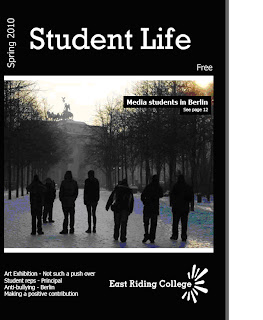
The masthead of the magazine is relatively simple, as is all of the text on the cover. The colour of the font does however work very well in contrast with the black background. Furthermore the advert as a whole does not particurlarly look aesthetically pleasing as the colours are too basic and there is nothing that particurlarly catches the readers' eye. The image that is used represents a college trip that the students embarked on to Berlin, however personally i don't think that the choice of image is a good choice for the magazine as you cannot see anyone's face clearly, you can only see a siloutte. The only way the reader can tell that it is from a college trip is because the caption in the photograph clearly states it. The layout of the caption is aesthetically pleasing as it stands out against the image as the text is placed in a black text box, and the text is white.
Institution
The institution for this magazine is East Riding College. This is a college that has campuses all over the East Riding. Their campuses are based in Hull, Beverley and Bridlington. The college welcomes more than 1,500 students a year. The variety of courses that you can do at the college range from full-time courses aimed at 16 to 18-year-olds to higher education courses, like degrees and foundation degrees, to part-time courses which can last anything from four hours to three years.
Ideology
East Riding college is an ambitious College, with a desire to improve the standard of teaching they provide and the campuses their students come to. East Riding College was rated as a "good" college by Ofsted in 2007.
Audience
The magazine is aimed at 16-19 year olds as they are the majority of students that attend doing full-time courses. However part-time courses are available for adults wanting to get back into education. So the magazine could relate to this minority also.
Representation
The image represents a college that whichever part of the East Riding you are from doesn't detract away from you gaining a place at the college as there are campuses all over the East Riding. From the advert i can tell that the college has alot of success within the art and media departments, as they are the two departments mentioned on the cover. Student representatives are something the college are proud of, and also bullying is something that the college take seriously as it is one of the coverlines on the front cover of the magazine.


No comments:
Post a Comment