Thursday, 21 October 2010

Evaluation

After looking myself at existing fashion magazines, my fashion  magazine for Wyke College follows many of the conventions that magazines have generally. For example the masthead is big and bold, and it stands out from the rest of the cover. The masthead itself covers the whole of the top of the magazine cover, therefore making it easier for the consumer to see when it is stacked on shelves in shops. I have included a price on the magazine, however i haven't included a bar code, as the magazine will be sold in college as oppose to in a shop. If the magazine were to be bought in a shop then i would make sure that a bar code were to be placed on the magazine cover at the bottom right hand corner. I have chosen to have the coverlines rotated a little, which wouldn't maybe occur on real magazines, however i did this merely to make my magazine unique. The main cover line for the magazine is in a bigger typeface than the others, to make it stand out more. I have chosen to only have one image on the cover of the magazine, as a main focus, whereas most magazines you see in the shops will have more than one on the cover to give you a taste of what is inside the magazine. However i didn't feel that my magazine needed extra images adding in as it would detract away from the main image i already have in place. The masthead itself is quite long, however it is a word that will stick in your head, and it is also a very recognised word in this sector of journalism, therefore i do not personally think that the customers will mind. If i could of gotten the same effect from a shorter word, i would of used it. But i think 'Catwalk' works well as it is quite snappy.

One of the cover lines on the cover, is about a fashion show. This could get anyone in the college together, therefore brings a sense of unity to the college environment, and make everyone work as a team. The college focuses a lot on equality and i felt that doing this particular cover line would reflect this as it would bring anyone that was interested in any aspect of fashion or be it textiles, they could join the fashion show and/or purchase the magazine and not be ruled out.


This particular magazine is aimed at students with a keen interest in fashion and textiles, however it is not aimed solely at them. There could maybe be other students around the college that are just as interested but do not study the subjects.

I have placed an image on the front cover of a student putting the finishing touches to a garment she has made for the fashion show. This could attract the audience as they would be intrigued as to what she was doing. Also with the magazine not only focusing on a fashion show for the college, but showing that 20% discount is available at most stores it could be aimed at any one with an interest in fashion. I have tried to include cover lines on the cover that people can relate to and want to pick up and purchase the magazine to find out more about. As i know i do that when i am out shopping for magazines, i always look for the interesting cover lines that then inspire me to buy the magazine and hope for a good read. I have included fashion tips, so not only students that study textiles or have an interest in fashion; but anyone, can spruce their winter wardrobe with the fashion tips. Therefore making my magazine appeal to a fair amount of the college. 

In the process of constructing my magazine, i have used such programs as Photoshop, Publisher and Word. Although i dominantly used photoshop, i realised that Publisher and Word could be used as well to help with layout and fonts. I have had a little bit of trouble with photoshop and found it difficult as it is a program i am not all that familiar with, however i tried my hardest and i have made a magazine cover and draft of a contents page that i am proud of. The skills i have learnt doing this preliminary task will hopefully enable me to gain a better relationship with technology and learn that it is on my side, and come out in the end with a finished piece i am proud of. 

contents page draft

finished magazine cover

final photo choice

I have chosen this particular photo as it represents everything
i wanted my magazine to represent. The student in the image is 
engrossed in what she is doing. This shows that students work
hard at Wyke. Also it fits in well with the theme of the magazine
which is fashion and textiles. It is the most suitable of all the images
i had taken, as on this image the students' face is not covered by her
hair, and even though the shot is taken on a side, it is still a medium
close-up and works well as nothing is hidden. The image links in well
with the main coverline, which is about a fashion show. As the student could be 
making the garment for the fashion show.

photographs

This photo is one i am going to consider using as my front cover image, 
as it shows Kayley, sewing the garment she has made, this fits in well with the theme of fashion and textiles, and also fits in with the main cover line which will be about a fashion show. This image is particularly useful as Kayley is looking toward the camera with a welcoming smile. This will draw readers in to purchase the magazine as they will see Kayley and wonder what the picture represents.

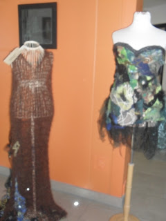
This image is of two dresses that students from the college have made for themselves, 
I like this photo as i could use it for my contents page rather than my front cover
to show dresses that will be modelled in the fashion show.
This is a close-up of one of the dresses.
I will use it in my contents page.

This again is a close-up of one of the dresses, 
I will not use it for my front cover, i will instead use it on my contents page.

This is an image of a student making the finishing touches
to a garment she has made in textiles, this could be a good 
image to use for my cover as it links well with the cover line 
about the fashion show as the garment could be featured
in the show. The fact the student isn't looking directly
at the camera works well as it shows that she is engrossed in
what she is doing.

This is again an image of a student making the finishing touches
to a garment she has made. It could be a good image to
use for my front cover as she is looking very happy
and showing a little of what textiles students get 
to do in their lessons, also it ties in well with the fashion show coverline.

This is a good image to use as my front cover
as not all of the student's face is covered by her hair 
like a previous image, you can see clearly what she is doing. 
She looks engrossed in the task she is doing, and again it links in well with 
the fashion show coverline so would be an ideal image to use.

front cover ideas

This my first idea for my front cover, i think it is pretty plain and simple. But it could work. However i am going to change it a little, and change the coverlines around a little.

This is the layout i am going to use, as it looks unique and i want my magazine to look original and not like any other. 

cover lines i am going to use

My magazine will feature the following cover lines:

  • Wyke's annual fashion show- ( date and time)
  • Kayley's fashion tips- look your best this winter
  • 20% discount in some high street stores this month, get your NUS before it's too late!
I have chosen to only do three coverlines as i feel that if i were to do any more, the page would look too crowded and cluttered. The magazine of course will feature a lot more than what is on the cover, however the cover lines are the important stories of the magazine. I believe that these are the stories that will draw readers in and make them want to purchase the magazine.

sell-line ideas

My magazine is called 'Catwalk' therefore i will need a sell-line (preferably underneath the masthead) that goes well with the fashion and textiles theme.

My ideas are as follows;

  1. Strut your way to success - I like this particular sell-line as it fits well with the masthead'Catwalk', as models 'strut' down the catwalk, therefore the readers of the magazine will think that because they have purchased this magazine that they will do well.
  2. Succeed in style - I like this sell-line as again it fits in well with the whole theme of the magazine; fashion and textiles. It is along the same wavelength as the previous sell-line. That students who purchase the magazine will feel like they can succeed because of the content of the magazine helping them. 
  3. Walk your way to success at Wyke- This sell-line is too long i think, however it was just an idea. Based around the fact that the magazine is called 'Catwalk' therefore students again will believe that if they pick up the magazine that they will succeed in college.
  4. Go a long way - This is a slightly shorter sell-line, i have thought of it as it incorporates the masthead 'Catwalk' again, as catwalks are generally quite long therefore giving the impression that students that purchase the magazine will go a long way at Wyke, doing so. 
Final Decision- My final choice for the sell-line is number 1 : strut your way to success as personally i believe that it fits in well with the theme of the magazine and it will help sell the magazine as it is snappy and will stick in the readers' heads.Therefore will make them want to keep buying it every issue.

masthead font ideas and analysis


These are the three font choices for my magazine. Each one of them is completely different. 
The first font is quite 'fun' and is quite eye catching, however i do not think personally that the font is suitable for my fashion magazine as it doesn't represent fashion and textiles. Also i think that the font looks too messy. I want my magazine to be quite tidy and neat. The second font is my own take on 'VOGUE''s masthead. The font is  a lot thinner, however the upper case lettering states importance and my fashion magazine would need to portray that impression. The last font represents class and also importance which are the two conventions i particularly wanted to portray.  The font is also very neat and tidy, and these are also conventions i would like my magazine to have. Therefore from this analysis i can tell that the last font is the most suitable for my magazine. So i will use the third font in my magazine. Not only for the masthead but for all of the coverlines too as i think that the font represents everything a magazine based around fashion and textiles should represent. It is not too fussy or messy and it looks aesthetic pleasing therefore it will persuade readers to pick up and read the magazine as the font will attract them to it.

Thursday, 14 October 2010

Chosen name for my magazine

I have chosen to call my magazine 'Catwalk' as it fits in more with the theme the magazine will have which is fashion and textiles. Also the name is quite snappy therefore will not make the magazine look too cluttered.

Initial Magazine Ideas

I would like to base my college magazine around fashion and textiles. It is not something i study, however i have a keen interest in it and wanted to explore it and make my magazine about these specific subjects.
I have thought about names for the magazine these are:
  • Catwalk - I thought of this name as it is to do with fashion and it will represent my main coverline, which is a fashion show. 'Catwalk' will be easily recognisable, as it is something both students that study textiles and students that do not will recognise. It is not too long a name therefore it will still look aesthetically pleasing and not too cramped or squashed into the top.
  • Madame - I thought of this name as it is french for female. This would be good as a name for my magazine as the magazine is based around women. Again, the name is not too long therefore it wont make the magazine look too cluttered.

Thursday, 7 October 2010

LIIAR Analysis of two existing college magazines


LIIAR Analysis of 'GX' magazine

Language
The masthead is just a simple two lettered masthead. This works well as it is easily recognizable and is suitable for a magazine as it is not too long. The letters are in bold therefore they stand out more against the blue background. The font is written in white and contrasts well with the blue background, however it could have been thought through alot better as the white does not look aesthetically pleasing against the skin colour. Having the website on the cover is a good thing to have as it gives the reader another place as well as the magazine to look for information on the college. The choice of image are simple but work well with each other. They are not specific to one gender as a female and a male person are used, therefore it makes the magazine appeal ro both genders. The colour that the coverlines are written in could do with being a darker shade of blue as you cannot see it very clearly. Usually the slogan on magazines is placed underneath the masthead however the slogan on this magazine is at the bottom.

Institution
The institution for this magazine is 'The Grimsby Institute'. The Grimsby Institute is situated in Grimsby,Lincolnshire. The college is a further education college focusing mainly on vocational courses. The college is also a growing higher education college too, with it's main campus on Nun's corner in Grimsby.The college has 1,350 staff and in the 2006/07 academic year, they had over 22,500 students.  The Institute also offers Work Based Learning programmes, providing apprenticeships for 16 to 24 year olds, and also offers a wide range of A/AS levels.

Ideology
The people in the magazine cover don't have faces, resulting in there being no fixed idea on age either, which shows that the college is open to everyone within reason.

Audience
The magazine appeals to both genders, as the main images on the front cover are both male and female. Therefore the magazine is for everyone that attends the college, there are no boundries against gender.

Representation
The choice of image represents a relaxed atmosphere, this will appeal to the audience as you would like to be relaxed in college. Also ''the word on the street' slogan shows that Grimsby Institute is a different sort of college to Wyke. A different sort of image is portrayed in the slogan, associating the college with 'the street' which is something that you wouldn't normally associate with a college. Also the meaning behind 'word on the street'  means that alot of people have been talking about the college, again representing that the college is open to anyone.


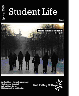
LIIAR Analysis of East Riding College's 'Student Life' magazine.

Language
The masthead of the magazine is relatively simple, as is all of the text on the cover. The colour of the font does however work very well in contrast with the black background. Furthermore the advert as a whole does not particurlarly look aesthetically pleasing as the colours are too basic and there is nothing that particurlarly catches the readers' eye. The image that is used represents a college trip that the students embarked on to Berlin, however personally i don't think that the choice of image is a good choice for the magazine as you cannot see anyone's face clearly, you can only see a siloutte. The only way the reader can tell that it is from a college trip is because the caption in the photograph clearly states it. The layout of the caption is aesthetically pleasing as it stands out against the image as the text is placed in a black text box, and the text is white.

Institution
The institution for this magazine is East Riding College. This is a college that has campuses all over the East Riding. Their campuses are based in Hull, Beverley and Bridlington. The college welcomes more than 1,500 students a year. The variety of courses that you can do at the college  range from full-time courses aimed at 16 to 18-year-olds to higher education courses, like degrees and foundation degrees, to part-time courses which can last anything from four hours to three years.

Ideology
East Riding college is an ambitious College, with a desire to improve the standard of teaching they provide and the campuses their students come to. East Riding College was rated as a "good" college by Ofsted in 2007.

Audience
The magazine is aimed at 16-19 year olds as they are the majority of students that attend doing full-time courses. However part-time courses are available for adults wanting to get back into education. So the magazine could relate to this minority also.

Representation
The image represents a college that whichever part of the East Riding you are from doesn't detract away from you gaining a place at the college as there are campuses all over the East Riding. From the advert i can tell that the college has alot of success within the art and media departments, as they are the two departments mentioned on the cover. Student representatives are something the college are proud of, and also bullying is something that the college take seriously as it is one of the coverlines on the front cover of the magazine.

LIIAR Analysis of the brief

Language
The main conventions that i must include in my college magazine are; a medium close-up photograph, a masthead, tagline and coverlines. These are all conventions seen on all college magazines i have looked at so far.

Institution
The institution for my college magazine is Wyke College itself because this is where the magazine will be made, and Wyke is the college that all of the content in the magazine will be based around. Wyke College is situated in West Hull, however not all of the students here are from Hull. 50% of students live in Hull, and 50% live in the East Riding of Yorkshire. Last year 75% of the students at Wyke College gained a place at university.


Ideology
The ideology my magazine should represent is the beliefs involved around college life as a whole. The whole aspect of respecting others and equal opportunities will be incorporated somehow and also hard-work is rewarded at Wyke College, therefore this will need to be apparent in the magazine, and easily recognizable as students will need to know about the ideology behind the magazine.

Audience
Wyke College
is a sixth form college; therefore the students here are aged between 16 and 19 years of age. So this age range will be the audience for my magazine.65% of students that attend Wyke College are female,therefore my magazine will be aimed towards the female majority of the college population.

Representation

The photograph i choose to place on the front cover of the magazine needs to be suitable for the students, both current and prospective to relate to. Therefore the photograph i choose cannot give a bad impression about the college, and i need to think carefully about the photograph i am going to place on the cover. As the photograph will be the first thing the reader will look at when looking at the magazine, so it needs to represent the college. Also the coverlines i choose to write about need to be exciting, and make the reader want to carry on reading.

Outline of the brief

Using DTP and an image manipulation program, produce the front page of a new college magazine,featuring a photograph of a student in medium close-up plus some appropriately laid out text and a masthead. Additionally i must also produce a mock-up of the layout of a contents page to demonstrate my grasp of DTP.