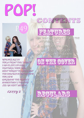
For my coursework, I was set the task to create a music magazine and create three pages; the front cover, the contents page and the double page spread. I had to make sure that I had a minimum of four original images altogether.
My magazine uses conventions of real media products, as the layout is similar to other magazines that are available to buy. The layout of my magazine is conventional as it has a masthead, cover lines, bar codes and a price. I have also included the issue number and the month of publication on the front cover. I have chosen to do my magazine in the pop genre, as I feel that there aren’t any magazines currently in publication available to buy that cover this genre. Pop magazines need to be eye catching and bold and bright, and the text needs to be legible as young people will be need to read it. As there aren’t any magazines covering the pop genre, it was hard to get inspiration for my magazine, so I decided to look at magazines aimed at young girls such as ‘Bliss’ and ‘Sugar’ magazine as these are the closest I thought I could get to actual pop magazines. The font I have decided to use for the masthead is conventional for a pop magazine as it is bold and eye catching. I had to make sure that the image on the front cover was conventional and not too small.
For the contents page I had to make sure that this was conventional, I had to make sure that the word ‘contents’ is on the top of the page otherwise this isn’t conventional. I split the contents page into three sections ‘features’, ‘on the cover’ and ‘regulars’. This allows there to be a clear layout and no confusion of the magazine articles. I also think that doing this it looks better and also more conventional, therefore my magazine looks just like a magazine should. My double page spread follows the conventions of a double page spread as the main front cover star, has to be on the double page spread otherwise it isn’t conventional. I have also included the name of the girl group that the article focuses on. I have used the same font as I did on the front cover, to provide continuity and to make the magazine flow. Also it is the girl groups’ identity. The colours I have used throughout the magazine represent pop as a genre as they are eye-catching. Also the magazine is aimed at young girls, therefore I needed to represent the audience and make it eye catching for them. The only thing I would improve on on my magazine is the fonts on the front cover, looking back now they are quite hard to read and complex, therefore they aren’t conventional.
My media product represents the social group of young teenagers, as I have chosen to use competitions as a selling point for my magazine. The competitions I have chosen to include in my magazine are backstage passes to t4 on the beach which is a concert in western super mare and includes all of the pop artists. It isn’t while the summer however it would be something good for them to look forward too. Also I have included a chance to win vip tickets to see The Saturdays, I have chosen to do this as The Saturdays are a band that represent the pop genre. I have chosen to make the competitions VIP and Backstage as this will make the young girls feel special.
I believe that my media product would be distributed by IPC media, as they distribute NME magazine. Even though NME and my magazine are completely opposing genres I believe that they would sell well on the same institution. NME is a magazine targeted at young males, however my media product is targeted as young females.
The audience for my media product is young girls between the age of 13-16 I believe this is a reasonable audience for the magazine, as the magazine is a pop magazine and girls conventionally listen to pop. I believe they would buy my magazine as it is eye catching and very bold and bright and those are the main conventions of a pop magazine.
Looking back at the preliminary task to now, I believe I have improved my technological skills. As during the preliminary task I didn’t really understand photoshop as a programme, however now I feel like I understand and know how to use it properly. I have also improved my knowledge of how to conventionally produce a magazine, as my preliminary task didn’t really follow the conventions of a magazine layout as the coverlines were rotated. I thought at the time that it looked good, however looking back now I can tell I was foolish in doing this. However I have taken that on board and made sure that the cover lines on my music magazine are conventional and the general layout of the magazine is conventional. I also feel that I have got more confidence with photo shop and I aren’t scared to try new effects or skills. I believe that I have generally bettered myself technologically. I have also put a lot more work into this task than the preliminary task as I didn’t realise the importance of research in a task like this. I am glad I did the preliminary task though, as other wise I would have been completely clueless as to how to start my music magazine.


